How to Get Your Fantasy Map Ready for Print (KDP, IngramSpark and Ebooks)
The map that kept your draft honest is not yet the map that goes in the front of your book. A print map has to survive things a working map never meets: a page about the size of your hand, black ink on cream paper, a printer that rejects soft images, a binding that swallows the middle of a spread, and an ebook reader on a phone. None of it is hard once you know the numbers, and the numbers come from your printer, not from taste. Here is how to take a fantasy map from your screen to a paperback, a hardcover and an ebook, with the official KDP and IngramSpark specs linked so you can check them yourself.
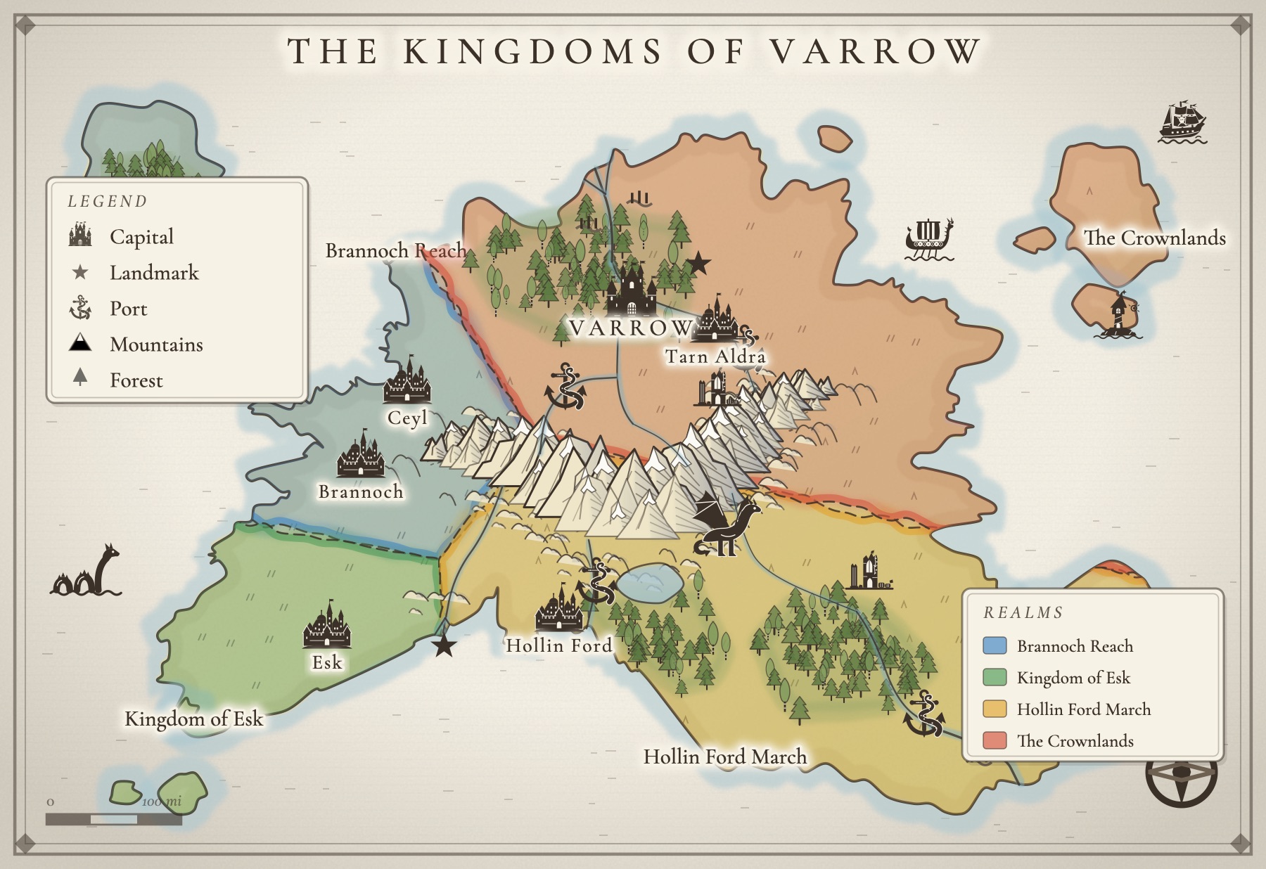
Finish the book before you finish the map
Every renamed town and moved battle in revision is a change to a print map. The Book Designer's fantasy world map guide recommends waiting until the final draft before making the map that appears in the book, and that is the cheapest advice in this guide. Draft with a rough working map (our guide to a map for your novel covers that part), then make the print map once the manuscript has stopped moving.
Where the map goes in the book
Maps traditionally sit in the front matter, after the title page and before chapter one, as Cambric's guide to formatting a fantasy novel puts it. That way the reader meets the world before the story asks them to navigate it. The same guide suggests a common split for books with several maps: the world map in front, detail maps such as a city in the back. Another option is a detail map at the start of the part of the book set there.
A map across two facing pages looks grand, but the middle of it disappears into the binding. Keep every name and anything important out of a band down the center, or use two full-page maps instead. IngramSpark's print file requirements ask for the interior in single-page format, and its upload troubleshooting post says files sent as spreads are rejected, so a spread map is really two images, one on each page.
Start from your trim size, then work out the pixels
Print resolution is about pixels per inch at the size the map prints, so you cannot know what you need until you know the page. KDP's image guidance sets a minimum of 300 DPI for interior images and shows the math: a 1200 by 1800 pixel image printed at 4 by 6 inches is 300 DPI. IngramSpark's print file requirements recommend 300 ppi for all images. Both warn against enlarging an image after you place it, which only lowers its resolution.
Here is what a full-page map needs at 300 DPI on three common paperback trims from KDP's trim, bleed and margins page, where 6 by 9 inches is listed as the most common US paperback size. The "inside the margins" column assumes a book of 151 to 300 pages (KDP's inside margin is 0.5 inch at that length, more for longer books) and KDP's 0.25 inch minimum on the other edges.
| Trim | Map inside the margins | Pixels at 300 DPI | Full bleed page | Pixels at 300 DPI |
|---|---|---|---|---|
| 5 × 8 in | 4.25 × 7.5 in | 1275 × 2250 | 5.125 × 8.25 in | 1538 × 2475 |
| 5.5 × 8.5 in | 4.75 × 8 in | 1425 × 2400 | 5.625 × 8.75 in | 1688 × 2625 |
| 6 × 9 in | 5.25 × 8.5 in | 1575 × 2550 | 6.125 × 9.25 in | 1838 × 2775 |
A map smaller than the full page needs fewer pixels; shrinking an image on the page raises its effective DPI. Check your own layout program's margins, and check page count, because the inside margin grows as the book gets thicker.
Bleed or no bleed
Bleed means the art runs off the edge of the page, so the trim cannot leave a white sliver. On KDP that means extending the image 0.125 inch past the trim on the top, bottom and outside edge, and the catch is that bleed applies to the whole file: if one page needs it, the entire interior must be set up with bleed, as a PDF. IngramSpark asks for the same 0.125 inch on the top, bottom and outside edges, and never on the bound edge. For most novels, the simpler choice is a framed map that sits inside the margins, no bleed at all. It looks deliberate, it prints reliably, and it does not change how the rest of your book is set up.
Black ink on cream paper
Most novels print with a black-and-white interior, and a map designed in color does not always survive that. Two kingdoms in green and red can come out the same middle gray. IngramSpark advises converting images to grayscale for black-and-white books, and KDP notes that a color photo prints in color only if you choose a color ink option. The better fix is to make a map that was black and white from the start:
- Tell regions apart with border lines, hatching and the names themselves, not with fill color.
- Keep thin lines and pale washes to a minimum. A light gray on screen can vanish on uncoated paper.
- Convert a copy to grayscale yourself before you upload, and look at it at print size. If you cannot tell the realms apart, neither can a reader.
- Order a printed proof. Screens glow; paper does not.
Names a reader can actually read
The most common print map failure is not resolution, it is lettering. A map you designed full screen on a monitor shrinks to a few inches across, and every name shrinks with it. Before you upload:
- Print one page at actual size on a home printer and read every name at a normal reading distance.
- Cut names, then enlarge the rest. A print map only needs the places the story mentions. Fewer names can each be larger.
- Use size for importance. Realms and seas largest, cities next, villages smallest, and nothing so small it blurs.
- Keep names off the edges. Anything within a quarter inch of the trim, or near the binding, is at risk.
Maps in ebooks
An ebook map gets read on everything from a tablet to a phone held in one hand, so plan for the small screen. KDP's reflowable image guidelines say images with text, maps included, should be legible and take up at least 80% of the screen width. They also ask for the sRGB color profile and note that Kindle does not support images with transparent areas (transparent backgrounds turn white).
A full continent with forty names will not read at phone width, however sharp the file. Include the full map for orientation, then split the world into regional close-ups, each its own image with only the names that region needs, placed where the story arrives there. Color is fine in an ebook even if your paperback is black and white, so this is one place a color version of the map can earn its keep.
Licensing: make sure the map is yours to print
A map in a book you sell is a commercial use, and what you are allowed to do depends on where each piece of it came from. Check all of these before you upload:
- The tool. Map makers set their own terms. Inkarnate's FAQ, for example, is admirably clear: its free tier carries a personal-use license and its Studio plan includes commercial use. Read the terms of whatever you used, save a dated copy, and if they do not answer your question, ask the maker in writing.
- Asset packs and brushes. Stamps and textures from a third-party pack have their own license, separate from the tool.
- Fonts. Check every typeface on the map. Fonts under the SIL Open Font License may be embedded and used commercially, and the license does not extend to documents you make with them.
- Real-world map data. If any part of the map comes from OpenStreetMap, the OSM Foundation's attribution guidelines ask printed works to credit OpenStreetMap and print the URL openstreetmap.org/copyright, beside the map or wherever your book puts its other credits.
- A hired artist. Get a written agreement that says what you may use the map for: the book, the ebook, the cover, merchandise.
What Inkling's map exports give you
If you make your map in Inkling, here is exactly what the Download menu produces. Every PNG is the map's sheet multiplied: Picture is 2×, Picture, print size is 4× and Picture, poster size is 8×. The SVG is a vector file with no fixed pixel size, for a designer or a layout program that takes vector art. The inches below are the largest each file prints at 300 DPI.
| Sheet | Picture (2×) | Print size (4×) | Poster size (8×) |
|---|---|---|---|
| Screen (3:2, the classic sheet) | 1200 × 824 px · 4 × 2.7 in | 2400 × 1648 px · 8 × 5.5 in | 4800 × 3296 px · 16 × 11 in |
| Book page (2:3 portrait) | 1200 × 1800 px · 4 × 6 in | 2400 × 3600 px · 8 × 12 in | 4800 × 7200 px · 16 × 24 in |
| Poster (3:4 portrait) | 1200 × 1600 px · 4 × 5.3 in | 2400 × 3200 px · 8 × 10.7 in | 4800 × 6400 px · 16 × 21.3 in |
| Square (1:1) | 1200 × 1200 px · 4 × 4 in | 2400 × 2400 px · 8 × 8 in | 4800 × 4800 px · 16 × 16 in |
| Wide (16:9) | 1200 × 676 px · 4 × 2.3 in | 2400 × 1352 px · 8 × 4.5 in | 4800 × 2704 px · 16 × 9 in |
What that means for a paperback:
- The Book page sheet is shaped like a 6 by 9 page. It is 2:3 portrait, the same proportions as a 6 by 9 trim, and its print size PNG (2400 × 3600) covers a full-bleed 6 by 9 page at 300 DPI with a sliver to spare. A realm is redrawn to fit when you switch sheets; city maps are drawn on the Screen sheet only.
- The free Picture is a working map, not a print map. At 1200 pixels across it prints 4 inches wide at 300 DPI, and stretched across the 5.25 inch live area of a 6 by 9 page it falls to about 230 DPI, under KDP's minimum. It also carries a small "Made with Inkling" credit in the corner.
- Print size, poster size and the SVG need a Map Pass or a paid Plus subscription. A Map Pass is $29 a year or $4 a month; Plus is $9 a month. Both remove the credit and give unlimited downloads. Without one, you get 2 Picture downloads, and the free trial works the same way.
- There is a Black & white style, black ink on white paper, made for printing. Pick it under Style, then check the names: every name and stamp has a Size control, so you can enlarge the ones that will be too small at paperback size.
- Exports are RGB. Convert a copy to grayscale (for a black-and-white interior) or CMYK (if your printer asks for it) in your layout or image program before you upload.
- Real-street city maps carry an OpenStreetMap credit. City layouts built on real street plans print "Streets © OpenStreetMap contributors · openstreetmap.org/copyright" in the corner of every export, which is the credit the OSM guidelines above ask for. Keep it on the map. Maps exported before October 11, 2026 carry an older credit without the web address, so for those add openstreetmap.org/copyright beside the map or on your copyright page.
- Lettering. The Google typefaces Inkling's styles use are packed into the SVG. If you hand the SVG to a designer, have them open it and check the names look the way you expect; the PNG is a picture of exactly what you saw.
- Licensing. The maps you make in Inkling are yours to use commercially: in your books (print and ebook), on your website, in newsletters, in crowdfunding campaigns and on merchandise for your own work. The terms spell it out. Two things stay on the map: the OpenStreetMap credit on real-street city maps, and the small Inkling credit on free downloads (downloads with a Map Pass or Plus don't have one). What you can't do is sell or share the stamps and map art on their own, as an icon set or asset pack.
And the map is only one page of the book. If you are still drafting, Inkling's writing desk keeps the manuscript, the Storyboard, your character cards and the map on the same desk, so the world in the front of the book matches the one in chapter thirty. Our guide on how to publish a book covers the rest of the road to print, and pricing has every plan.
A few questions, answered
What resolution does a map need for KDP or IngramSpark?
Plan on 300 DPI at the size the map prints. KDP asks for a minimum of 300 DPI for interior images, and IngramSpark recommends 300 ppi. To check, divide the image's pixel width by the printed width in inches. A 6 by 9 inch paperback with a framed map inside the margins needs roughly 1575 by 2550 pixels; a map that runs to the edge of the page needs about 1838 by 2775.
Where does the map go in a novel?
Usually in the front matter, after the title page and before chapter one, so readers meet it before the story begins. If you have several, a common pattern is the world map in the front and detail maps, such as a city, in the back or at the start of the part where they matter.
Can I put a color map in a black-and-white paperback?
Yes, but it will print in gray, and colors that look distinct on screen can turn into the same gray. IngramSpark advises converting images to grayscale for black-and-white interiors. Better still, make a black-and-white version of the map on purpose, using lines, patterns and labels to tell regions apart instead of color.
Does my map need bleed?
Only if the art runs right to the edge of the page. Bleed means extending the image 0.125 inch past the trim on the top, bottom and outside edge. On KDP, if one page has bleed the whole interior file must be set up with bleed, so most novelists keep the map inside the margins with a frame around it.
How do I make a fantasy map readable in an ebook?
Assume it will be seen on a phone. KDP's guidance says images with text, maps included, should be legible and take up at least 80% of the screen width. A whole continent with forty names will not read at that size, so include the full map and then a few regional close-ups, each a separate image with only the names that region needs.
Can I sell a book with a map I made in a map maker?
That depends on the tool's license, not on the fact that you made the map. Some tools state it plainly; Inkarnate, for example, lists a personal-use license on its free tier and commercial use on its Studio plan. Read the terms of the tool and of any asset packs or fonts before you print, keep a dated copy, and ask the maker in writing if the terms are unclear. Inkling's terms allow commercial use of the maps you make, in books, on websites and on merchandise for your own work.
All of it. In one place.
This isn't five apps stitched together. Your storyboard, your cast, your maps, your covers, and the story itself all live on one desk, right beside the words. Nothing to sync between tools. No five separate subscriptions. Just everything a writer needs, finally in the same place.