How to Make a Fantasy Map Look Old (Antique, Inked, Gilded)
A map that looks old earns a reader's trust before they have read a single name on it. It says this world was here long before the story began, surveyed by people who walked it. The good news is that old maps are not old because of burnt edges and tea stains. They look old because of a handful of habits: a small palette, confident ink, engraved texture, honest paper, lettering with a hierarchy, and the little ceremonies of a frame, a compass and a monster in the sea. Here is each habit, the trap that ruins most attempts, and how to get three antique looks without painting anything.
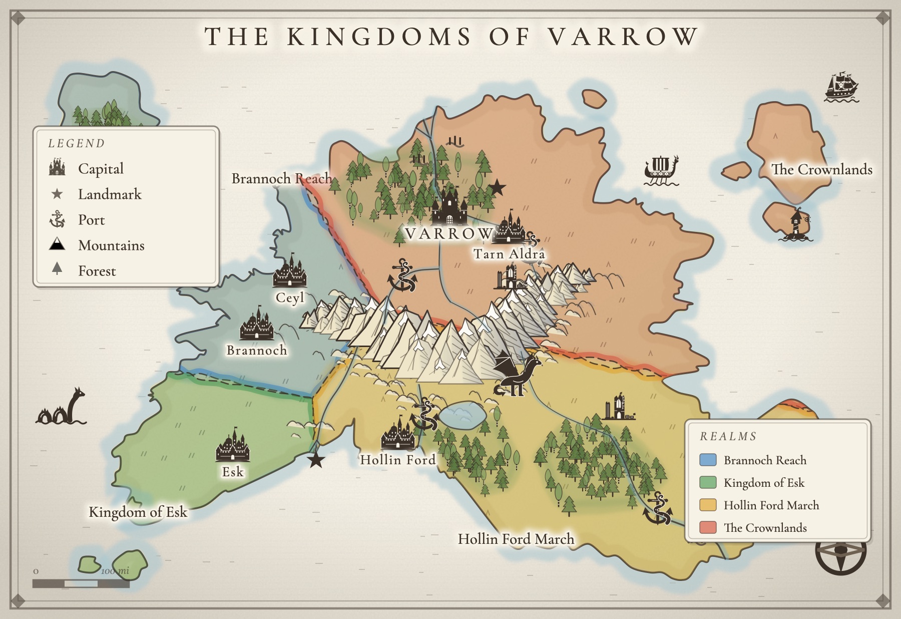
Old maps are restrained
The single biggest tell of a modern map is color: bright greens, saturated blues, a different hue for every region. Old maps were made with very little. Printed maps were often black ink on cream paper, and any color was brushed on afterward by hand as a thin, transparent wash, usually along borders or over a few territories, never everywhere. If you want a map to look old, start by taking color away. Pick a warm ink (brown-black or sepia reads older than pure black), a paper tone, and at most a few soft washes to tell one kingdom from the next. Let the paper do most of the work.
Let the ink line carry it
Antique maps are drawings first. Coastlines, rivers, mountains and towns are all made of line, and the line is consistent: one pen, one hand, one weight family across the whole sheet. That consistency is what makes a map feel authored rather than assembled. The fastest way to break it is to mix symbols from different sources, a painted castle here, a flat icon there, a photographic tree somewhere else. Choose one drawing style for every symbol and keep to it. A coastline drawn with a slightly heavier line than everything inland, and a few ripple lines echoing it out into the water, will do more for the antique look than any texture.
Engraved hatching instead of flat fills
Before color printing was cheap, maps were engraved into copper plates, and engravers could not print a flat gray. They built tone out of lines: closely ruled horizontal lines for water, diagonal hatching on the shadowed flanks of mountains, short strokes for hills, little stippled dots for sand. That texture is the signature of the engraved atlas look. If your map uses flat fills for sea and land, try replacing them with ruled lines for the sea and hatching for relief. It instantly reads as a plate pulled from an old book.
Paper tone, not a coffee stain
Real old paper is warm and slightly uneven, with a faint grain and the occasional soft darkening toward the edges. It is not burnt, torn, or wearing a ring from a mug. A warm cream or parchment ground with the gentlest grain is enough. If you add aging, keep it below the threshold of notice: a reader should feel that the paper is old, not see that someone made it look old. For a night-sky or deluxe edition look, the same rule applies in reverse: a deep ink-blue paper with cream line and gold reads as luxurious and antique, as long as it is even and calm.
Lettering with a hierarchy
Old maps letter different kinds of places in different ways, and that hierarchy is a big part of why they look right. A common pattern: regions and kingdoms in widely spaced capitals, seas, rivers and lakes in italics, cities and towns in an upright serif, sized by importance, and the title in the most decorative face on the sheet. Stick to two or three faces at most, keep the names off the busiest linework, and do not label everything. Blank space is part of the antique feel; a map crowded with names reads as a diagram.
A cartouche, a compass rose and a scale bar
The ceremonial parts of an old map are what readers remember. A cartouche is the decorated panel or ribbon that carries the title. A compass rose, often an eight-pointed star in a ring, tells the reader which way is north and quietly signals that the land has been surveyed. A scale bar in miles or leagues, and a small legend explaining the symbols, finish the effect. You need all of them on a world map, and none of them should be loud: the same ink, the same restraint, tucked into open sea or an empty corner.
A frame worth framing
Almost every antique map sits inside a border, and a plain rectangle is the giveaway of a screenshot. A double rule, a heavier outer line with a fine inner one, is the classic choice, and small ornaments at the corners make it look finished. If your map is going in the front of a book, it helps to think about the shape of the sheet too: a portrait page sized for a frontispiece, with the frame and title planned for it, looks far more like a real endpaper map than a landscape map squeezed onto a page.
Here be monsters, in the empty water
Old mapmakers hated an empty sea. They filled it with whales, serpents, giant squid and ships under full sail, partly as decoration, partly as warning. Your fantasy map can borrow the habit with a purpose: put the sea serpent off the coast your heroes must cross, the galleon on the trade route, the whale in the far north where no one sails. One or two creatures in open water make a map feel inhabited and old. A dozen make it look like a sticker sheet.
The over-texturing trap
The most common way to ruin an antique map is to try too hard. A few things to avoid:
- Grunge on top of everything. A heavy paper texture laid over the whole map muddies the linework, which is the part that actually makes it look old.
- Burnt edges and torn corners. They read as a prop, not a document.
- Every region a different color. Two or three soft washes are plenty.
- Five fonts. Two or three faces, used consistently, look more period than a parade of fantasy typefaces.
- Mixed art. Symbols from different packs, in different hands, break the illusion faster than anything.
How to get each look in Inkling
Inkling's map maker is built around these habits, so the antique look is a choice from a menu rather than an evening of painting. Every stamp, from the castle and the tavern to the sea serpent and the galleon flying the skull, is drawn in one bold single-ink style, and it re-inks itself whenever you change the style, so your map always looks like one hand made it. Three house styles give you three kinds of old:
- Inkling Wash is soft watercolor under one ink line: a warm paper, gently granulated washes for the land, and pale tints for dunes, marsh and snowfields. It is the friendly storybook endpaper.
- Copperplate is the engraved atlas look: a single dark ink on cream, the sea built from fine ruled lines, hatching for shade, and names set in classic small capitals. It is the closest thing to a plate pulled from an old atlas.
- Gilded Night is ink-blue paper with cream line and gold-leaf lettering, the special-edition look. It comes with a Map Pass.
There is also a plain Black & white style for printing and photocopying, which is handy if your map is going into a paperback.
Lettering has its own menu. Keep the style's own face, or set every name in a classic serif, engraved capitals, a handwritten pen or a clean modern sans. A single name can take its own face too, and any text you add can be set as a Place, a Region (tracked out, the way kingdoms are lettered) or a Sea (in italics, the way water is named), which gives you the old hierarchy without thinking about it.
The ceremony comes built in. The ready-made world layouts are drawn inside a double-ruled border with corner ornaments, and they come with a compass rose, a scale bar and a legend you can drag wherever there is open sea. You can stamp more of each from the tool tray. For the front of a book, choose the Book page sheet, a portrait shape made for a frontispiece. Then add a serpent or a giant squid in the empty water, name what your story touches, and leave the rest of the coast blank.
And because the map lives in the same project as your draft, your characters and your storyboard, it is right there while you write. When a place on it starts to feel like a scene, press Write a story here and a new story opens, set on that map, with the places you named in its notes. If you are starting from nothing, the guide to making a fantasy map for your book covers the geography first, and the map maker page shows everything it can do.
A few questions, answered
How do I make a fantasy map look old without it looking fake?
Work on the drawing, not the damage. A restrained palette, one confident ink line, engraved hatching in place of flat color, warm but even paper, and well ordered lettering will make a map read as antique on their own. Burn marks, coffee rings and heavy grunge textures are what make a map look like a costume. Use them lightly, or not at all.
What colors do old maps use?
Very few. Many old printed maps were pure black ink on cream paper, with any color added by hand as a thin wash, usually just along borders or over a few regions. A sepia or brown-black ink, a warm paper tone, and one or two soft washes for kingdoms will look far more period than a full, saturated palette.
What is a cartouche on a map?
A cartouche is the decorative panel that holds the map's title, and often the maker's name, the date or a dedication. On antique maps they were scrolls, ribbons, shields or framed panels, sometimes surrounded by figures. On a fantasy map, a simple ribbon or framed title panel in the same ink as the rest of the map does the job beautifully.
Why do old maps have sea monsters on them?
Partly to fill large empty stretches of water, partly to mark seas thought to be dangerous or unknown, and partly because mapmakers enjoyed drawing them. On a fantasy map they do the same work: a serpent or a giant squid tells the reader where the danger is, and it keeps a wide sea from looking unfinished.
Can I make an antique-style map without art skills?
Yes. The antique look comes from choices, not brushwork: which palette, which lettering, where the monsters go. Inkling's map maker draws in an engraved style called Copperplate, a watercolor and ink style called Inkling Wash, and a gold-on-midnight style called Gilded Night (with a Map Pass), so you choose the look and place your world, and the drawing is done for you.
All of it. In one place.
This isn't five apps stitched together. Your storyboard, your cast, your maps, your covers, and the story itself all live on one desk, right beside the words. Nothing to sync between tools. No five separate subscriptions. Just everything a writer needs, finally in the same place.