Fantasy Map Symbols and Legends: A Key Readers Understand
Most readers look at the map in the front of a fantasy novel for about thirty seconds. In that time they need to find the capital, the road out of it, the mountains in the way and the sea at the edge, without being taught anything. That only works if your symbols are ones they already know and your legend is short enough to read at a glance. Here are the conventions worth borrowing, the habits that make a map look drawn by one hand, and how to build a key that answers questions instead of raising them.
Pick a stamp, tap the realm to drop it, drag it into place, double-tap to name it.
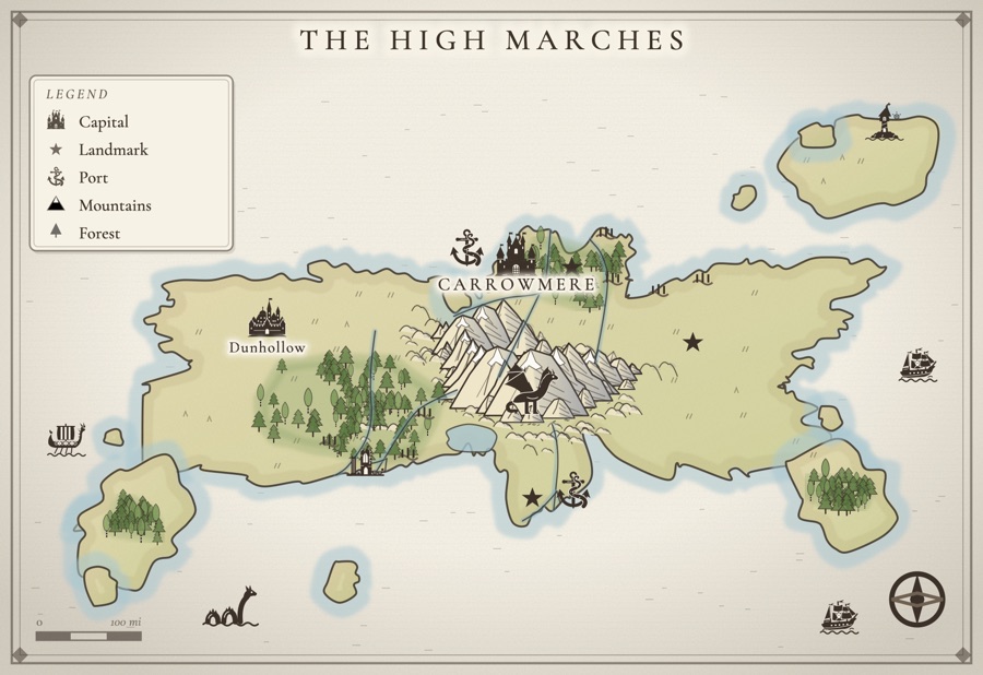
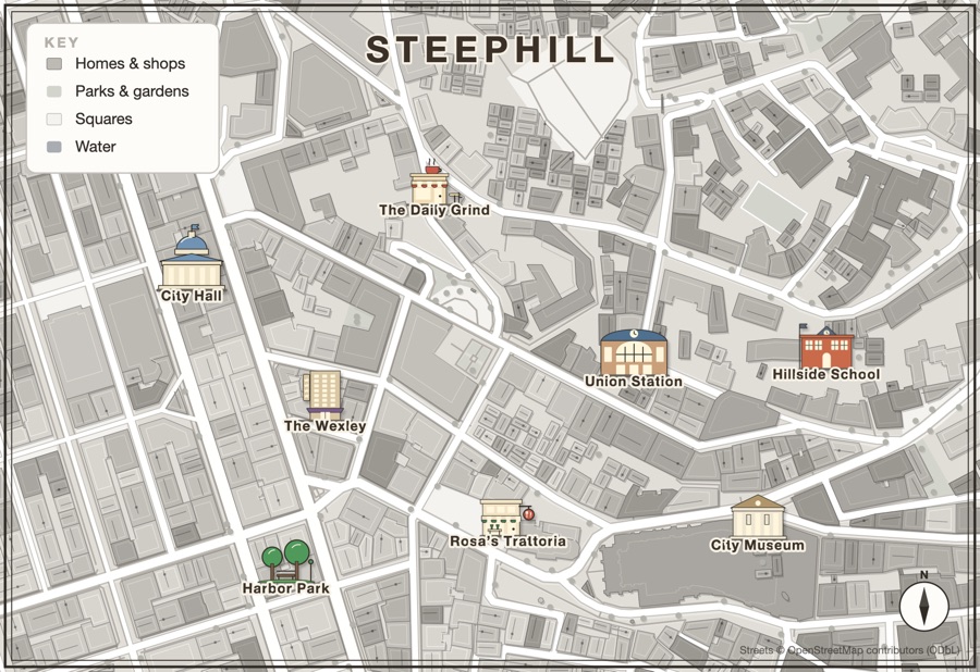
What a legend is actually for
A legend, or key, is a short contract with the reader: these marks mean these things, everywhere on this map. It is not a catalog of everything you drew. Its job is to answer the questions a reader would otherwise have to guess at. Which of these three cities is the capital? Is that broken shape a ruin or a quarry? Is that dashed line a road or a border? If a mark needs no explanation, it does not need a line in the key. If it does, it should get one, every time.
A good test: hand the map to someone who has not read your book and ask them to trace the route from the capital to the coast. Every place they hesitate is a symbol that needs to be clearer, or a symbol that belongs in the key.
The conventions readers already know
Fantasy maps borrow from centuries of real mapmaking, which is lucky, because it means readers arrive already fluent. Lean on that fluency instead of inventing a new visual language.
- Capital. The biggest, grandest settlement mark on the map: a castle, a walled city, or a city mark with a star beside it. If anything on your map deserves a legend entry, it is this.
- City. A cluster of roofs, towers or a ring of walls. Bigger than a town, smaller than the capital.
- Town. A few buildings around a spire or a market. Market towns sit on roads and rivers, so put them there.
- Village and hamlet. A couple of cottages, or simply a dot with a name. Most of the places on a map are this size, so they should be the quietest marks on it.
- Castle, keep and fort. A tower or a walled keep for a seat of power; a stockade or star fort for a military post on a frontier.
- Port. An anchor is the near-universal sign. A lighthouse on the headland tells the reader the coast is dangerous.
- Ruins. Broken columns or a wall open to the sky. Many maps also letter the name in italics, or as "ruins of", so readers know no one lives there now.
- Mountains. Drawn from the side, as peaks, in chains that follow a spine rather than scattered like teeth. Shade one face consistently so the light seems to come from one direction.
- Forests. Clusters of trees that fill an area, not single trees dotted about. Pines for the cold north, palms for warm shores, and a darker, denser stand where the woods are old.
- Rivers. Thin at the source, wider toward the sea, flowing downhill from high ground. Rivers join on their way down; they very rarely split.
- Roads. Thin lines that connect places someone would actually travel between. Many maps use solid lines for main roads and dotted lines for tracks; whichever you choose, say so in the key.
- Borders. A dashed or dotted line, often with a soft color wash on each side. Dashed borders and dotted roads look alike at a glance, so if you use both, put both in the key.
Size and lettering carry the hierarchy
Readers rank places by size before they read a single name. The capital should be the largest settlement mark, then cities, then towns, then villages, with no exceptions. The lettering follows the same ladder: realm and region names in large, widely spaced capitals across the land; city names larger than town names; village names small. Seas, lakes and rivers are traditionally lettered in italics so water never gets confused with land. Get this hierarchy right and you can drop half the entries from your legend, because the map explains itself.
Keep one consistent hand
The maps readers love look like one artist drew every mark. The fastest way to break that spell is to collect symbols from five different sources: a detailed castle next to a flat clip-art tree next to a cartoon dragon. Even readers who could not explain why will feel that the map is pasted together. Keep the line weight, the level of detail and the drawing style the same across every symbol, and use color lightly, a wash to tell realms apart rather than a different palette for every icon.
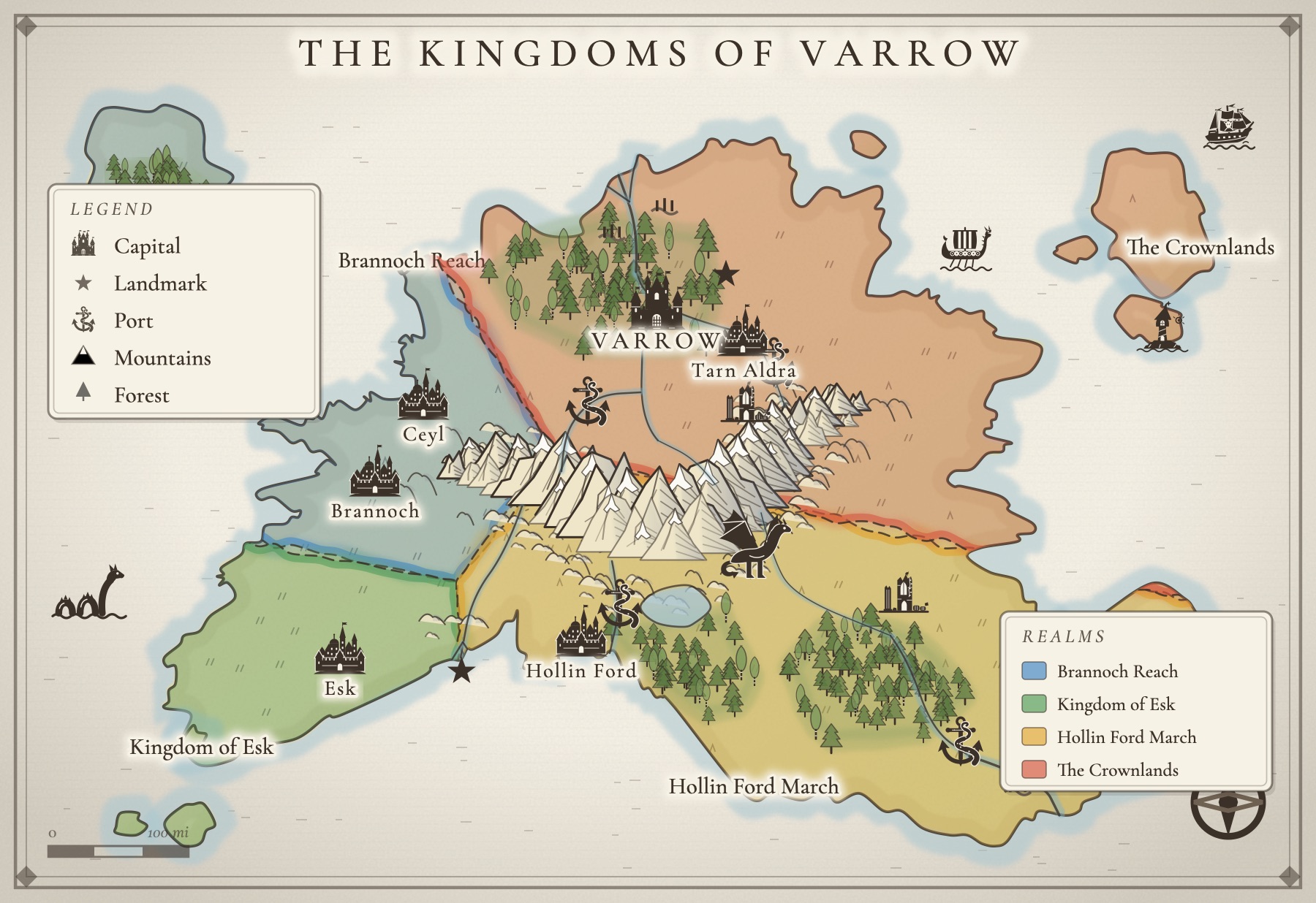
Both maps above were made in Inkling's map maker. Every castle, town, tavern and sea serpent is drawn in the same bold ink style, and each one re-inks itself to match when you switch between Inkling Wash, Copperplate and Gilded Night.
Keep the key small
A legend with twenty entries is a sign that the symbols are doing too little work on their own. Aim for five or six. Start with the marks a reader could genuinely misread (capital versus city, ruin versus town, road versus border), add anything you invented that has no real-world equivalent, and stop. If you have a dragon over the mountains, you do not need to key it; readers understand a dragon. If a red mark means "the plague year", you do.
If your world has several kingdoms, give them a separate realms key: each realm's name beside a swatch of its color. It is the one list readers come back to, because it is how they keep track of who rules where as the plot moves.
Where the key goes
Put the legend somewhere it covers nothing the story needs: open sea, a blank corner of wasteland, the margin beyond the known world. Group it with the compass rose and the scale bar so the reader finds all the instructions in one place. And check the map at the size it will actually appear. A map printed small in the front of a paperback loses fine detail fast, so symbols that need squinting at should be simpler, and the key should be legible without a magnifying glass.
How Inkling handles symbols and keys
Inkling's map maker is built around these conventions so you can spend your time deciding, not drawing. The Places stamps cover the full settlement ladder, from castle and walled city down through town, village and a plain dot, plus towers, temples, lighthouses, ruins and ports. Ready-made settlements (a walled city, a harbor town, a hamlet and a fort) drop in as one piece. Marks for a landmark, danger, a banner and an X marks the spot sit alongside them, and creatures like a dragon or a sea serpent go wherever the danger is. Every stamp is drawn in one bold ink style, so nothing looks borrowed.
For the key itself, there is a framed legend card you can drop onto the map, which explains the five marks readers ask about most: capital, landmark, port, mountains and forest. When you carve the land into realms, each one gets its own color and a border you can set to dashed, solid, dotted or no line at all, in ink or in the realm's own color. Add the realms key and it lists every realm by name beside its color, and keeps itself up to date as you name, add or split them. A compass rose and a scale bar finish the corner. Place names, region names in spaced capitals, and sea names in italics follow the lettering conventions above without you having to think about them.
Because the map lives in the same project as your draft, you can check it in a second while you write, and the Write a story here button starts a story from the places you named on it. Need names for all those towns first? Try the free fantasy name generator, then read how to make a fantasy map for your book for the geography side.
A few questions, answered
What is the difference between a map legend and a map key?
In everyday use there is none: both mean the small box that tells the reader what the symbols on the map stand for. Some cartographers call the box the legend and the list of symbol meanings inside it the key, but readers use the words interchangeably, so pick one and stay consistent.
What symbols should a fantasy map legend include?
Only the ones a reader could misread. Capitals, ports, ruins, landmarks and anything dangerous usually earn a place. Mountains, forests, rivers and towns are almost always understood without help, so you can leave them out or keep them as a quick reminder. Five or six entries is a comfortable maximum.
How do you show a capital city on a fantasy map?
Make it the largest or most elaborate settlement mark on the map, usually a castle, a walled city, or a city mark with a star. Pair it with the biggest town lettering on the map, and add it to the legend so there is no doubt which city rules.
How should borders be drawn on a fantasy map?
Borders are usually a dashed or dotted line, often with a soft color wash on each side so the realms read at a glance. Run them along rivers, ridges and coasts where you can, because that is where real borders settle, and list each realm with its color in a small realms key.
Do I need a scale bar on a fantasy map?
It helps. A scale bar is a promise about travel times, and readers who see one will quietly check whether a journey in chapter ten matches the distance. If you include one, use it yourself while drafting so the story keeps that promise.
All of it. In one place.
This isn't five apps stitched together. Your storyboard, your cast, your maps, your covers, and the story itself all live on one desk, right beside the words. Nothing to sync between tools. No five separate subscriptions. Just everything a writer needs, finally in the same place.